
How to Create Effective Data Visualization Using Tableau: A Concise Guide
Data visualization is a powerful tool for transforming complex datasets into an easily understandable format. One widely used software for creating captivating visualizations is Tableau. This powerful platform offers a diverse range of chart types and interactive features, enabling users to effectively communicate their data insights and tell a compelling story.
To create impactful visualizations in Tableau, it is crucial to understand the data you are working with, as well as the context and goals of the analysis. This foundation enables you to select the most appropriate chart types and design elements, thus creating visualizations that effectively convey the underlying message.
In this article, we will explore key strategies for harnessing Tableau’s capabilities to create engaging data visualizations. By following these proven techniques, you can ensure that your work not only captures your audience’s attention but also delivers valuable insights in a clear and concise manner.
Table of Contents
- Getting Started with Tableau
- How to Install Tableau on Your System
- Understanding Tableau Interface
- Creating Basic Visualizations
- Applying Filters and Sorting Data
- Customizing Visualizations
- Creating Interactive Dashboards
- Sharing and Publishing Dashboards
1. Getting Started with Tableau
Tableau is a powerful tool for creating effective data visualizations. In this section, we will discuss the basic steps to get started with Tableau, exploring the differences between Tableau Desktop and Tableau Public, connect to data sources, and understand data fields and dimensions.
Tableau Desktop vs Tableau Public
Tableau offers two main products for creating visualizations: Tableau Desktop and Tableau Public. Tableau Desktop is a professional, paid version of the software that allows for more advanced features and functions, while Tableau Public is a free version with some limitations. The main differences between the two are:
- Tableau Desktop allows for more data source connections and has additional features for data preparation.
- Tableau Public has limitations on the number of rows and data sources you can use, and all visualizations created with Tableau Public are available to the public.
Despite these differences, both versions offer a powerful platform for creating data visualizations and can be used to develop a strong understanding of Tableau’s capabilities.
Connecting to Data Sources
Tableau supports a wide variety of data sources, including Excel files, databases, and cloud data storage.
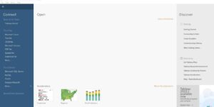
After successfully installing Tableau, connecting to data sources is an excellent way to start with Data Visualization.
Steps to Connect Data Sources to Tableau:
- Launch Tableau: Start by launching the Tableau Desktop application on your computer.
- Connect to a Data Source: In Tableau, click on the “Connect to Data” button, usually located in the top-left corner of the application window. This opens a window where you can quickly choose the specific type of data source you want to connect to.
- Select the Data Source Type: Tableau supports several data sources, including databases, spreadsheets, cloud services, and more. Choose the appropriate data source type from the list provided. For example, let’s say you want to efficiently connect to a Microsoft Excel spreadsheet; select the “Excel” option.
- Locate and Access the Data: Specify the location or path to the data you want to connect to after selecting the data source type. This may involve browsing for files, entering server information, or providing login credentials, depending on the type of data source you selected.
- Connect and Import Data: Once you have specified the data source and provided the necessary details, Tableau will establish a connection to the data source and load the data into the application. You may have options to customize the import process, such as selecting specific tables or columns to import, applying filters, or performing data transformations.
- Explore and Analyze the Data: After the data is imported, Tableau will present it in a workspace where you can explore and analyze it. For example, you can drag and drop fields onto shelves to create visualizations, apply filters and calculations, and perform various data manipulations to gain insights from your data.
- Create Visualizations and Reports: Use Tableau’s intuitive drag-and-drop interface to create visualizations, such as charts, graphs, maps, and dashboards. You can customize the appearance and formatting of visualizations, add interactivity, and combine multiple visualizations into interactive reports.
- Refresh Data: Tableau allows you to establish a live connection to your data source, enabling real-time updates in your visualizations as the underlying data changes. Alternatively, you can also choose to extract the data into Tableau’s proprietary data format, allowing you to work offline or improve performance.
It’s worth noting that the specific options and steps may vary depending significantly on the version of Tableau you are using and the type of data source you want to connect to. Tableau provides comprehensive documentation and resources on connecting to various data sources, so referring to the official Tableau documentation can provide more detailed instructions for your specific scenario.
Understanding Data Fields and Dimensions
After connecting to a data source, Tableau organizes your data into two main categories: fields and dimensions. Fields can be either measures or dimensions. Measures are quantitative data, such as revenue or sales, while dimensions are qualitative data, such as region or product category.
When creating visualizations in Tableau, it is essential to understand the difference between measures and dimensions, as this will impact how you build and interpret your charts and graphs. To summarize:
- Measures: Numeric values that can be aggregated (sum, average, median, etc.), such as sales and profit.
- Dimensions: Categorical values that help describe and organize your data, such as geographic location or product type.
By leveraging the power of measures and dimensions, you can create insightful and effective data visualizations in Tableau by combining and comparing these categories to reveal hidden patterns and relationships in your data.
Welcome to mastering Data Visualization with this innovative tool called ‘Tableau.’ This comprehensive step-by-step guide is primarily designed to help you unlock the full potential of Tableau and transform your data into impactful visualizations. Whether a beginner or an experienced analyst, this guide will provide you with both the knowledge and skills necessary to create stunning visual representations of your data using Tableau’s powerful features and functionalities.
2. How to Install Tableau on Your System

Tableau offers different packages to a wide variety of businesses, and each business can use any of them to meet its needs. Your choice of Tableau package depends on the type of work your organization is handling.
For instance, Tableau Desktop is a package (program) enabling users to perform highly complex data analysis tasks and generate interactive, dynamic representations that explain the results. In addition, users can also share their visualizations and analysis with team members or other employees within an organization. This allows employees to check the data and note what matters to their department or team.
In order to start using Tableau, you need to download the setup from the official platform. This is the only way to ensure you are using the right platform.
Therefore, to install Tableau on your system, visit the Tableau website and navigate to the “Products” section.
Select the version of Tableau you want to install.
Tableau offers multiple products, including:
- Tableau Desktop
- Tableau Server
- Tableau Public
Tableau Desktop is the most commonly used version for individual users and data analysts.
Choose the operating system you use (Windows or macOS) from the available options. Then, click on the respective download button.
Once the Tableau installer is downloaded, locate the file and then double-click on it in order to kick-start the installation process.

The installation wizard guides you swiftly through the entire installation process.
First, read and accept the license agreement, choose the installation location (or keep the default), and select the desired options during the installation.
The installer copies all the necessary files and installs Tableau on your system. The duration may vary depending on your system’s performance, so be patient and wait for the installation to complete.
After the installation, you can launch Tableau from the desktop shortcut, the Start menu (Windows), or the Applications folder (macOS).
You’ll be prompted to activate the product upon launching Tableau for the first time. Enter your Tableau product key or sign in with your Tableau account credentials if required.
Once activated, you can start exploring and analyzing data with Tableau. You’ll have access to various features and functionalities, such as creating visualizations, connecting to data sources, and building interactive dashboards.
It’s important to note that Tableau is a commercial software product requiring a license. Therefore, you may have to purchase a license or use a trial version if available.
Ensure to review the system requirements for Tableau before installing it in order to ensure your system meets the necessary specifications.
Related Article: ChatGPT Prompts to Analyze Data in Minutes
3. Understanding Tableau Interface
The Tableau interface consists of several components that allow users to interact with and analyze data.
The key elements of the Tableau interface:
- Menu bar: The menu bar is located right at the top of the Tableau window and contains various menus for performing actions such as opening, saving, and publishing workbooks, as well as accessing preferences and options.
- Toolbar: This toolbar is located right below the menu bar and provides quick access to commonly used tools and actions such as connecting to data, creating worksheets, and refreshing data.
- Data pane: The data pane is located on the left side of the interface and displays the data sources and fields available for analysis. It allows you to quickly connect to various data sources, drag-and-drop fields onto the workspace, and modify the data source properties.
- Workspace: The workspace is the main area in the center of the Tableau interface. It consists of sheets, dashboards, and stories where you can create visualizations and perform data analysis. The workspace adapts dynamically based on the selected sheet or object.
- Shelves: The shelves are located on the workspace’s left, top, and bottom. There are three main shelves:
- Columns shelf: You can drag and drop fields from the data pane onto the columns shelf to define the columns or dimensions displayed in the visualization.
- Rows shelf: You can drag and drop fields from the data pane onto the rows shelf to define the rows or dimensions displayed in the visualization.
- Marks shelf: The marks shelf allows you to customize the appearance and behavior of marks (data points) in the visualization, such as color, size, shape, and labels.
- Card pane: The card pane is on the interface’s left side, below the data pane. It displays contextual information and options related to the selected sheet or object. For example, when a chart is selected, the card pane displays options to format the chart, add filters, or create calculated fields
- Status bar: The status bar found at the bottom of the Tableau interface provides solid information about the current state of the workbook, such as the number of records within the data source, any data source or connection errors, and the progress of background tasks.
- Sheets and objects pane: The sheets and objects pane is on the interface’s left side, below the card pane. It displays a list of sheets, dashboards, and stories in the workbook. You can click on these objects to switch between different views or create new ones.
- Show Me: The Show Me pane is in the workspace’s top-right corner. It provides a gallery of visualization types that you can choose from to represent your data. By selecting a visualization type, Tableau automatically generates the appropriate chart based on your selected fields.
- Data Source tab: The Data Source tab is located at the bottom of the workspace. It displays the data source and allows you to manage the data connection, add or remove tables, join or blend data sources, create calculations, and set filters.
- Worksheet tabs: Worksheet tabs appear at the bottom of the Tableau interface, just above the Data Sources tab. Each worksheet represents a separate visualization or analysis view. Therefore, you can have multiple worksheets within a workbook and switch between them by clicking on the corresponding tab.
- Dashboard: Dashboards in Tableau allow you to combine multiple worksheets, views, and other interactive elements onto a single canvas. Dashboards are created in a separate tab and can present a consolidated view of your data, create interactive filters, and tell a story with your visualizations.
- Stories: Stories provide a way to create interactive presentations by combining worksheets, dashboards, and text. With stories, you can build a sequence of visualizations that guide the audience through a data-driven narrative.
- Formatting options: Tableau provides a wide range of formatting options in order to customize the appearance of your visualizations. You can access these innovative options through the Format pane, which appears on the left side of the interface when you select a specific element, such as a chart or axis.
- Data and View tabs: For worksheets and dashboards, there are two tabs located at the bottom of the workspace: the Data tab and the View tab. The Data tab displays the underlying data for the visualization, allowing you to examine the raw data and make modifications if needed. The View tab shows the visual representation of the data.
Related Article: How to create effective data visualization using Plotly
4. Creating Basic Visualizations
Let’s walk you through creating some basic visualizations using Tableau.
Connecting to Data:
- Launch Tableau and connect to your data source. Tableau supports various data sources such as Excel, CSV, databases, and more.
- Once connected, you’ll see the data source tab, where you can see the tables or sheets available in your data.
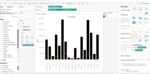
Creating a Bar Chart:
- Drag and drop a dimension field (categorical data) and a measure field (quantitative data) to the “Columns” and “Rows” shelves, respectively. For example, you can drag the “Sub Category” to the Columns shelf as well as “SUM Quantity” to the Rows shelf. Tableau will automatically create a bar chart showing the sales for each product category.
- You can customize the chart further by adding filters, sorting, and formatting options.
Related Article: Excel Functions to Master as a Data Analyst.
Building a Line Chart:
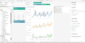
- Similar to the bar chart, drag a dimension field to the Columns shelf and a measure field to the Rows shelf. For instance, you can use the “QUARTER (order)” field on the Columns shelf and “SUM (profit)” on the Rows shelf. Tableau will create a line chart showing the revenue trend over time.
- You can format the axes, add reference lines, and customize the appearance of the line chart.
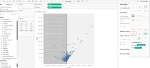
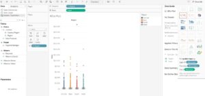
Generating a Scatter Plot:
- Drag a measure field to the Columns shelf and another measure field to the Rows shelf. For example, you can use “AVG (life expectancy)” on the Columns shelf and “AVG (adult Mortality)” on the Rows shelf. Tableau will create a scatter plot with profit on the x-axis and sales on the y-axis.
- You can further enhance the scatter plot by adding tooltips, color encoding, and size encoding based on additional dimensions.
Creating a Pie Chart:
- Drag a dimension field to the “Columns” or “Rows” shelf. For instance, you can use the “Year” field on the Columns shelf.
- Drag a measure field to the “Angle” shelf. For example, you can use “Sales” as the measure. Tableau will create a pie chart representing the sales distribution across different regions.
- You can adjust the labels, explode sections, and format the pie chart as needed.
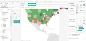
Designing a Map Visualization:
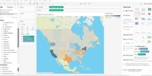
If your data contains geographical information, you can create maps in Tableau.
- Drag a geographic field (e.g., “City,” “Country,” or “Latitude/Longitude”) to the “Columns” or “Rows” shelf. Tableau will automatically generate a map visualization based on geographic data.
- You can customize the map by adding layers, changing the map type, and incorporating additional data using color encoding or tooltips.
Stacked Bar Chart:

- Drag a dimension field to the Columns shelf and a measure field to the Rows shelf.
- Drag another dimension field to the Color shelf. Tableau will create a stacked bar chart, where each bar represents a category, and the stacked segments within the bar represent a sub-category.
- You can customize the colors, sort the bars, and add labels or tooltips.
Area Chart:
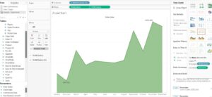
- Drag a dimension field to the Columns shelf and a measure field to the Rows shelf. Tableau will create an area chart showing the change in the measure over the dimension.
- You can adjust the formatting, add reference lines, and customize the area chart’s appearance.
Heat Map:
- Drag a dimension field to the Columns shelf and another dimension field to the Rows shelf.
- Drag a measure field to the Color shelf. Tableau will generate a heat map, where each cell represents the intersection of the two dimensions, and the color indicates the measure’s value.
- You can modify the color scheme, apply conditional formatting, and adjust the level of detail.
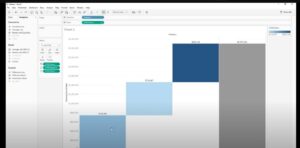
Gantt Chart:
- Use a date field on the Columns shelf.
- Drag a dimension field to the Rows shelf and adjust it to be discrete.
- Drag another dimension field to the Size or Color shelf to represent a different aspect of the data. Tableau will create a Gantt chart, useful for visualizing timelines and durations.
- You can customize the colors, adjust the size or color encoding, and format the chart accordingly.
Scatter Plot Matrix:
- Select multiple measure fields and drag them to the Columns and Rows shelves. Tableau will generate a matrix of scatter plots, showing the relationships between different pairs of measures.
- You can resize the scatter plots, adjust the axis scales, and add additional dimensions for color encoding or tooltips.
Tree Map:
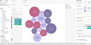
- Drag a dimension field to the Columns shelf and a measure field to the Size shelf. Tableau will create a tree map, where the size of each rectangle represents the measure’s value, and nesting rectangles represent the hierarchy.
- You can customize the colors, add labels, and adjust the hierarchy levels.
Waterfall Chart:
- Create a calculated field that represents the changes in a measure.
- Drag the dimension field to the Columns shelf and the calculated field to the Rows shelf. Tableau will create a waterfall chart showing the measure’s incremental changes. You can format the chart, add reference lines, and customize the colors.
Box Plot:
- Drag a dimension field to the Columns shelf and a measure field to the Rows shelf. Tableau will create a box plot, which displays the distribution of the measure, including quartiles, median, and outliers.
- You can customize the appearance, add reference lines, and modify the whiskers’ calculation.
Dual Axis Chart:
- Drag a dimension field and two measure fields to the Rows or Columns shelf.
- Right-click on one of the measure fields and select “Dual Axis.” Tableau will create a chart with two different measures sharing the same axis, allowing for easy comparison.
- You can customize the appearance, format the axes, and synchronize or unsynchronize the scales.
Word Cloud:
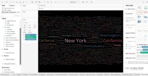
- Drag a dimension field to the Text shelf. Tableau will create a word cloud, where the size of each word represents its frequency or measure value.
- You can customize the color palette, adjust the word limits, and modify the text properties.
These examples should give you a good starting point for creating basic visualizations in Tableau. Remember to experiment with different chart types, explore the various formatting options, and leverage Tableau’s interactivity features to enhance your visualizations further.
5. Applying Filters and Sorting Data
Here’s how you can use Tableau to apply filters and sort your data:
- Connect to your data source: Start by connecting Tableau to your data source, whether it’s a spreadsheet, database, or any other supported data format. Tableau supports a wide range of data sources, and you can easily connect to them using the appropriate connector.
- Create a worksheet: Once your data source is connected, you can create a new worksheet by clicking on the “Sheet” tab at the bottom of the Tableau interface. This opens a blank canvas where you can start building your visualization.
- Drag dimensions and measures onto the canvas: In Tableau, dimensions are categorical variables, such as product categories or customer segments, while measures are numerical values, such as sales or profit. Drag the dimensions and measures from your data source onto the rows and columns shelves in the Tableau interface to define the structure of your visualization.
- Apply filters: You can use the “Filters” shelf in Tableau to filter your data. Drag the desired dimension onto the “Filters” shelf, and a filter control will be added to the interface. You can then use the filter control to specify the criteria you want to apply to your data. For example, if you have a “Region” dimension, you can apply a filter to show data only for a specific region or exclude certain regions.
- Filter options: Tableau offers various filter options. You can use basic filters to include or exclude specific values, apply range filters to specify a range of values, or use conditional filters to define complex filtering conditions based on logical expressions. Additionally, you can use quick filters to create interactive filter controls that allow users to dynamically change the filter criteria.
- Sorting data: To sort your data, you can use the sorting options available in Tableau. You can sort data by single or multiple columns in ascending or descending order. You can access the sorting options by right-clicking on a dimension or measuring on the rows or columns shelf and selecting the “Sort” option. You can also sort data by using the sort buttons that appear when you hover over a column header in a view.
- Multiple filters and sorting: You can simultaneously apply multiple filters and sorting options to your data. Tableau allows you to combine filters using logical operators, such as AND or OR, to create complex filtering conditions. Similarly, you can apply sorting to multiple columns to specify the particular order in which your data should be sorted.
- Interactivity: One of Tableau’s strengths is its interactivity. Filters and sorting can be made interactive by adding them to a dashboard. By creating a dashboard, you can combine multiple worksheets and allow users to interact with the filters and sorting options to explore the data dynamically.
6. Customizing Visualizations
You can customize visualizations using Tableau.
Here are the steps you can follow to customize your visualizations in Tableau:
- Connect to your data: Start by connecting to your data source in Tableau. Then, you can connect to various data sources like Excel, CSV, databases, or even live connections to databases.
- Choose the appropriate chart type: Tableau provides a wide range of chart types, including bar charts, line charts, scatter plots, maps, and more. Select the chart type that best represents your data and insights.
- Add dimensions and measures: Drag and drop the appropriate dimensions (categorical variables) and measures (numeric variables) onto the respective shelves in Tableau. Dimensions define how the data should be segmented, while measures determine the values to be plotted.
- Customize the appearance: Tableau allows you to customize various aspects of your visualization. Here are some common customization options:
- Formatting: Adjust the font, color, size, and style of your text to improve readability.
- Colors: Modify the colors of data points, bars, lines, or any other visual elements. You can use pre-defined color palettes or create custom color schemes to match your brand or data insights.
- Labels and tooltips: Add data labels to provide context and clarity. Customize tooltips to display additional information when users hover over data points.
- Legends: Edit legends to accurately represent the variables in your visualization.
- Axis settings: Modify the axis labels, tick marks, scaling, and formatting to better convey the data.
- Gridlines: Adjust the visibility and style of gridlines to enhance the visual appeal.
- Use filters and parameters: Tableau allows you to add filters and parameters to your visualizations, enabling users to explore the data interactively. Filters help users focus on specific segments or subsets of data, while parameters enable dynamic inputs and calculations.
- Create calculated fields: Tableau provides the flexibility to create calculated fields based on your data. These fields can be used to perform complex calculations and aggregations or apply custom formulas to enhance visualizations.
- Apply interactivity: Tableau supports interactive features like actions, highlighting, and tooltips. Utilize these features to provide a more engaging and dynamic user experience.
- Dashboard creation: Combining multiple visualizations into a dashboard provides a holistic view of your data. Arrange the visualizations, add titles, and apply filters across the dashboard to enable data exploration at different levels.
- Publish and share: Once you have customized your visualization, you can publish it to Tableau Server, Tableau Public, or Tableau Online to share it with others. These platforms allow you to collaborate, embed visualizations in websites, and control access to your data.
Creating Interactive Dashboards
Here are the key steps to creating interactive dashboards using Tableau:
- Connect to Data: Start by connecting to your data source(s) in Tableau. Tableau supports a wide variety of data sources, including databases, spreadsheets, cloud services, and more. You can connect to your data directly or use Tableau’s data preparation features to clean and transform the data.
- Create Worksheets: Once your data is connected, you can create individual worksheets to visualize and analyze specific aspects of your data. Each worksheet can contain multiple visualizations, such as bar charts, line charts, maps, and tables.
- Arrange Worksheets on a Dashboard: You can arrange them on a dashboard after creating the individual worksheets. A dashboard is a collection of worksheets and other dashboard objects that can be displayed on a single screen. To create a brand-new dashboard, click on the “New Dashboard” button in Tableau.
- Customize the Dashboard Layout: Tableau provides a flexible layout grid where you can drag and drop worksheets, text boxes, images, filters, and other objects onto the dashboard canvas. In addition, you can rearrange and resize the objects to create an intuitive and visually appealing layout.
- Add Interactivity: Tableau dashboards are known for their interactivity. You can add interactive features like filters, parameters, and actions to allow users to explore the data dynamically. For example, filters enable users to drill down into specific dimensions or measures, while actions allow users to navigate between different dashboards or highlight specific data points.
- Apply Formatting and Styling: To make your dashboard visually appealing, you can apply formatting and styling options in Tableau. For example, customize colors, fonts, backgrounds, and other visual elements to match your branding or design preferences.
- Publish and Share the Dashboard: Once you have created and finalized your interactive dashboard, you can publish it to Tableau Server, Tableau Online, or Tableau Public. These platforms allow you to securely share your dashboard with others, control access permissions, and embed the dashboard in other applications or websites.
- Regularly Update and Maintain: Data is constantly changing, so it’s important to keep your dashboards up to date. You can set up data refresh schedules in Tableau to automatically update the data in your dashboards. Additionally, periodically review and maintain your dashboards to ensure they reflect the most relevant and accurate information.
8. Sharing and Publishing Dashboards
Sharing and publishing dashboards in Tableau can be done in several ways, depending only on your requirements and the intended audience.
Here are a few methods you can utilize:
- Tableau Desktop: If you have Tableau Desktop installed on your computer, you can create dashboards and share them directly with others. Tableau Desktop allows you to save your workbooks locally or on Tableau Server/Online.
- Save locally: You can save your workbook (.twb or .twbx file) on your computer and share it with others via email, file-sharing platforms, or other communication channels. The recipient will need Tableau Desktop or Tableau Reader (a free tool) to open and interact with the dashboard.
- Publish to Tableau Server/Online: If your organization has Tableau Server or Tableau Online, you can publish your dashboards to these platforms. Publishing allows you to make dashboards accessible to a wider audience. Once published, users can access the dashboards through a web browser or Tableau Mobile app. You can set permissions and manage access to control who can view and interact with the dashboards.
- Tableau Public: Tableau Public is a free platform to share interactive dashboards publicly. With Tableau Public, you can publish your dashboards to the Tableau Public website, where anyone can view and interact with them. However, note that since it is public, the data in the dashboard becomes accessible to anyone.
- To share a dashboard on Tableau Public, you need to save your workbook to Tableau Public and publish it to the Tableau Public website. You can then share the dashboard’s URL with others, embed it in websites, or share it on social media.
- Tableau Reader: Tableau Reader is a free desktop application that allows users to open and interact with Tableau workbooks (.twbx files). If you save your workbook in a packaged format (.twbx), you can share it with others with Tableau Reader installed. However, keep in mind that Tableau Reader does not support live data connections or editing capabilities.
- Embedding dashboards: Tableau provides options to embed dashboards into websites, blogs, or other applications. You can generate an embed code from Tableau Server/Online or Tableau Public and integrate the dashboard into your desired platform. This allows users to interact with the dashboard seamlessly within the context of your website or application.
- Tableau Server/Online: If your organization has Tableau Server or Tableau Online, you can take advantage of their advanced features and capabilities. With Tableau Server, you can create user groups, set up data source connections, schedule automatic data refreshes, and more. Tableau Online provides similar functionality but is hosted on Tableau’s servers, allowing you to access and share dashboards from anywhere with an internet connection.
- With Tableau Server/Online, you can create projects to organize your dashboards and control access at a granular level. You can also set up subscriptions in order to send automated email updates to users or groups when data changes or specific events occur.
- Tableau Mobile: Tableau Mobile is a companion app available for iOS and Android devices. It allows users to readily access and interact with Tableau dashboards on their mobile devices. If you publish your dashboards to Tableau Server or Tableau Online, users can access them through the Tableau Mobile app, providing a seamless mobile experience.
- Collaboration and commenting: Tableau offers collaboration features that enable users to add comments, ask questions, and have discussions directly within the dashboards. This can enhance team and stakeholder collaboration, fostering data-driven discussions and insights.
- Exporting options: Tableau provides various exporting options allowing users to save dashboards snapshots for offline viewing or reporting purposes. Users can export dashboards as images (PNG, JPEG, or PDF), data (CSV, Excel, or Tableau Data Extract), or as a crosstab (Excel or CSV).
- Tableau Public Premium: While Tableau Public is free, Tableau Public Premium is a paid option that provides additional features and functionality. It offers increased data storage, privacy settings to restrict access to dashboards, and the ability to schedule automatic updates. Tableau Public Premium is suitable for individuals or organizations that require more control and advanced capabilities for their public dashboards.
Remember to consider data security and privacy when sharing dashboards. Be cautious not to share sensitive or confidential information with unauthorized individuals publicly. Additionally, ensure that you comply with any applicable data protection regulations and your organization’s policies regarding data sharing.
Saving Your Tableau Work
To save your Tableau work, you have a few options depending on your specific requirements:
- Save the Tableau Workbook (.twb): Tableau workbooks are the primary file format used to save your analysis and visualizations. To save your work, go to the “File” menu and select “Save” or use the shortcut Ctrl+S (Command+S on Mac). Next, choose a location on your computer to save the workbook and provide a name for it. Saving as a .twb file will preserve the connections, calculations, and visualizations you’ve created, but it will not save the data itself. Therefore, make sure your data source is accessible when reopening the workbook.
- Save the Tableau Packaged Workbook (.twbx): If you want to include the data along with the workbook, you can save it as a packaged workbook. This file format bundles the workbook and any necessary data sources into a single file. To save as a .twbx file, go to the “File” menu and select “Save As” or use the shortcut Shift+Ctrl+S (Shift+Command+S on Mac). Next, choose a location on your computer and provide a name for the packaged workbook. This format is useful when sharing your work with others who may not have access to the original data source.
- Publish to Tableau Server or Tableau Online: If you’re using Tableau Server or Tableau Online, you can publish your workbook directly to the server for others to access and collaborate. To do this, navigate to the “Server” menu and select “Publish Workbook” or use the shortcut Ctrl+Shift+P (Command+Shift+P on Mac). Next, provide the necessary connection information, select the project where you want to publish the workbook and click “Publish.” This option allows for centralized storage, version control, and sharing among team members.
- Export as an Image or PDF: If you need to save a static image of your visualization or want to create a printable document, you can export your Tableau workbook as an image (e.g., PNG, JPEG) or a PDF file. To export, go to the “File” menu, select “Export,” and choose the desired format. Next, specify the location as well as name of the exported file, and click “Save.” This method is suitable for sharing or embedding visuals in reports, presentations, or documents.
Remember to save your work regularly during your analysis process to avoid losing any progress.
Advancing Your Tableau Skills
Tableau Server and Tableau Online
Tableau offers two main platforms to further enhance data visualization skills: Tableau Server and Tableau Online. Tableau Server is an enterprise data visualization solution that supports high fidelity, secure, and scalable visual analytics. It can be hosted on-premises or in the cloud, giving organizations the flexibility to choose where they store their data.
On the other hand, Tableau Online is a cloud-based platform that allows users to publish, share, and collaborate on their visualizations. This solution comes handy since it doesn’t require any hardware setup and makes it easier for teams to work together on projects.
To advance your Tableau skills, it is crucial to familiarize yourself with both these platforms and leverage their unique features to create sophisticated, interactive dashboards that are easily accessible and shareable.
Utilizing the Tableau Community
The Tableau Community is an invaluable resource for those looking to improve their Tableau skills. This supportive and active community consists of experts, users and Tableau enthusiasts who share their knowledge and experience with others. By participating in the Tableau Community, you can:
- Discuss, ask questions, and receive feedback on your visualizations
- Learn new techniques and discover best practices
- Join user groups and attend events
Engaging with the Tableau Community will help you expand your understanding of the software’s capabilities and develop better data visualizations.
Exploring Online Courses and Resources
A wide range of online courses and resources are available to individuals aiming to improve their Tableau skills. Some popular options include:
- Data Visualization with Tableau: A Coursera specialization that offers in-depth, instructor-led training on various Tableau features, charting, table calculations, and mapping.
- Tableau’s official learning platform: Offers both free and paid resources, including videos, webinars, and self-paced training programs.
- Blogs and podcasts: Stay updated with the latest Tableau developments by following blogs, such as Tableau’s official blog, and listening to podcasts like DataStories, which cover various aspects of design and visualization.
Utilizing these resources will equip you with the necessary skills to create effective and visually appealing data visualizations using Tableau. Make sure to explore different courses and resources to find one that best suits your learning style and needs.
Final Thoughts
This post provides a comprehensive and practical resource for mastering data visualization with Tableau. Throughout the sections, we have explored the fundamental concepts of data visualization, learned how to analyze and clean data effectively, and discovered various techniques to create visually appealing and insightful visualizations.
By following this post you have gained a deep understanding of Tableau’s powerful features and functionalities, enabling you to transform raw data into compelling narratives and impactful insights. Whether you are a newbie or a proficient user, the step-by-step instructions and hands-on examples have equipped you with the necessary skills to navigate Tableau
confidently and generate high-quality visualizations.
Data Visualization using Tableau FAQs:
1. Is Tableau good for data visualization?
Yes, Tableau is excellent for data visualization, offering a user-friendly platform with powerful features, enabling both novices and experts to create compelling and interactive visuals.
2. What are the top 5 visualizations of Tableau?
The top 5 visualizations in Tableau are Bar Charts, Line Charts, Scatter Plots, Pie Charts, and Maps.
3. What are the 4 pillars of data visualization in Tableau?
The 4 pillars of data visualization in Tableau are Visualization Best Practices, Interactivity, Storytelling, and Exploration/Discovery.
4. Is Tableau still in demand?
Yes, as of my knowledge cutoff in September 2021, Tableau remains in high demand in many industries due to its strong capabilities in data analysis and visualization.
5. Is Tableau better than Excel?
Yes and no, it depends. Tableau is better than Excel for complex data visualization and interactive dashboards, but Excel might be preferred for simple data analysis and spreadsheet functions.
6. Is Tableau easier than Python?
Generally, yes. Tableau’s interface is user-friendly and designed for non-programmers, making it easier to use than Python for those without a programming background.
7. What is the hardest part about Tableau?
The hardest part about Tableau can be managing and preparing large and complex datasets for analysis.
8. Is PowerBI harder than Tableau?
It depends. Some users find PowerBI more intuitive, while others prefer Tableau. Both tools have their own strengths and learning curves.
9. Which is best Python or Tableau?
Neither is objectively “best”. Python offers more flexibility and is better for complex data analysis and machine learning, while Tableau is excellent for data visualization and interactive dashboards.
10. Is Tableau easier than SQL?
Typically, yes. Tableau’s user interface is designed to be more accessible for non-programmers compared to writing SQL queries. However, the complexity of the tasks you’re performing will also factor into which is easier.
What you should know:
- Our Mission is to Help you to Become a Professional Data Analyst.
- This Website is a Home for Data Analysts. Get our latest in-depth Data Analysis and Artificial Intelligence Lessons and Updates in your Inbox.

Tech Writer | Data Analyst | Digital Creator